We live for launching what’s new and shaping what’s next. Helping people create their own future is why we’re in business. People like the international award-winning Echo Spirits Distilling Company. We helped them get their brand foundation in place: purpose, positioning, personality, and visual identity. And then we grew the system along with them, so the brand evolves as they do. Here’s a peek at the process.
Echo Spirits is a craft distillery in Columbus, Ohio. When we talked to the founders, Joe and Nikhil, we saw that they knew where they wanted to go. They had a vision and a philosophy that made them different. But their biggest challenge was putting their finger on exactly how to articulate that vision in a way that was distinct. So, we started there. And over the course of five years, we’ve helped steer the Echo brand as they’ve grown the business from an idea to a reality. Throughout it all, Echo has gained the ability to define who they are and where they’re going.
We’ll walk you through the process via a few key questions we hear all the time.
How do we stand out from everyone else?
First, we checked our assumptions at the door. Then we started by researching competitors and best practices in craft distilling. We found opportunities for Echo to own a unique position. Competitors and peers focused on the spirits first (not an unreasonable approach). But no one was talking about the personalities behind the spirits. And more importantly, no one was talking about why they were making spirits.
We also found that ideas like “hard work,” “timeless traditions,” and “hand-crafted” permeate the craft distilling market. These things should be givens. They wouldn’t make Echo stand out on their own.
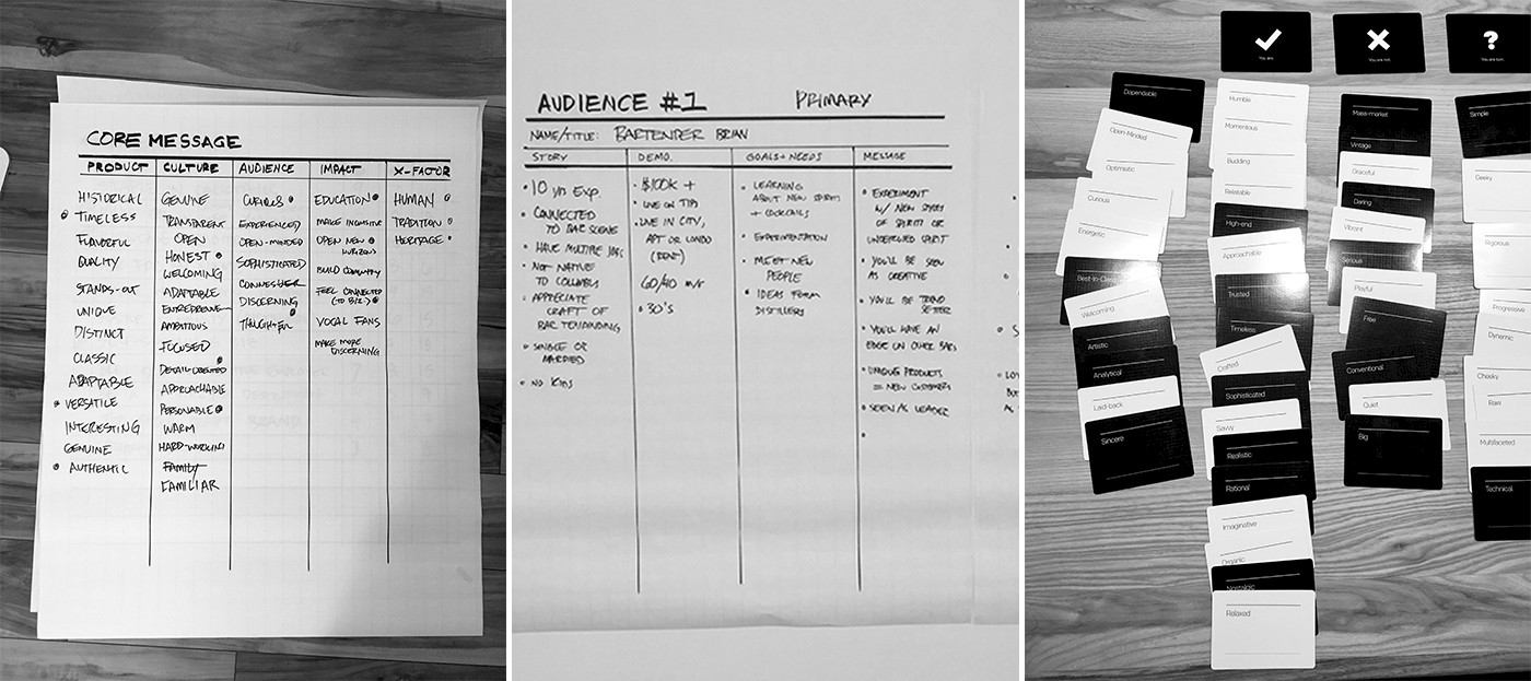
It’s critical to any branding project that our clients are invested in the process. They need creative advocates who know them, and that’s what Echo got. We put our discovery findings to the test in a collaborative workshop. Over the course of a day, we asked some big question and then we worked with Echo to find the right answers. We focused the Echo founders on their purpose and positioning and defined ways to articulate them in unique and consistent ways.
How do we connect with and keep loyal fans?
Before anyone else can know who you are, you have to know who you are. We built on the discovery work we did to lay the groundwork for the way people see, understand, and feel about Echo. Their vision is a return to a more personal way of doing business. At its core, it’s about connection, security, and dependability. People used to know the craftsmen behind their goods and services. Their tailor and their butcher. The family who owned the hardware store. So, why shouldn’t people know their distiller?
The idea of “Know Your Distiller” sums up their purpose and forms the creative platform for the entire identity system. We wrote a brand strategy document that detailed what they need to say, who they’re talking to, and what tone they should take. This gave us all a road map to be consistent when we talk about why, how, and what Echo does.
While we were finalizing the brand positioning, we got together for another workshop. This time, we started to build visual and verbal ideas on our strategic foundation. We used mood boards and found imagery to help everyone visualize design opportunities. The outcomes of this workshop, along with our final strategy, formed a rock-solid creative brief.
How do we get people to take us seriously?
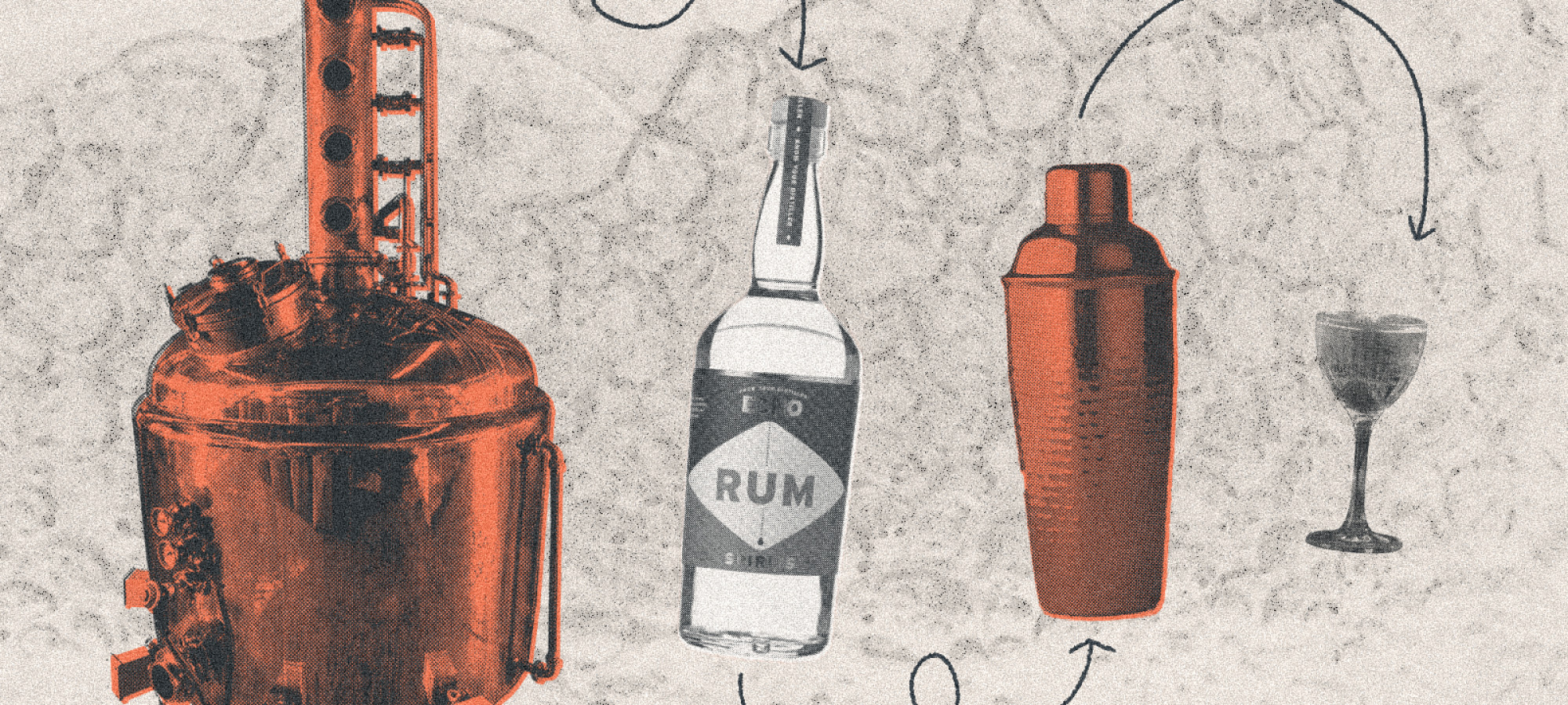
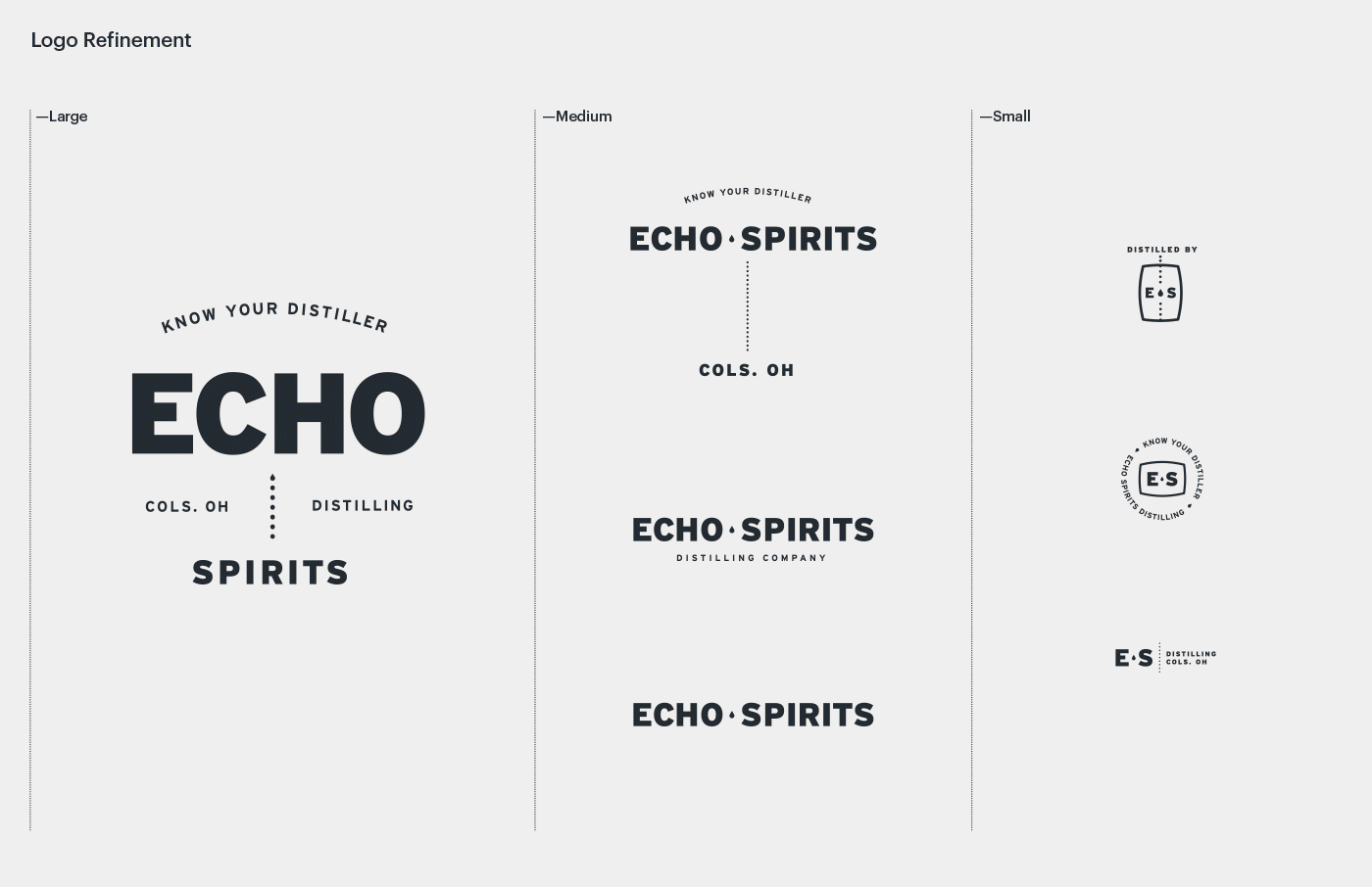
People pay attention to distinctive brands (they’re willing to pay more for them, too). And at its core, a brand identity is designed to do that: identify. For a consumer startup like Echo, that means two main components: a logo and a visual system. So that’s where we began. We explored logo concepts that tied directly back to Echo’s brand story. We also created a peek at how the logos might extend to a larger design language.
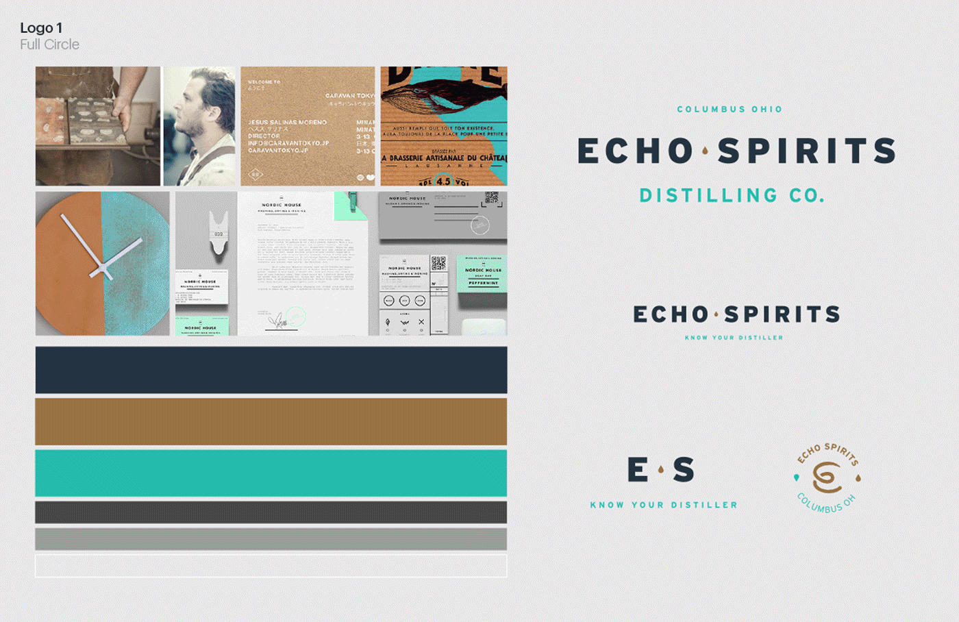
The final logo takes inspiration from historical shop window typography, tying back to their purpose of getting back to a more connected community. The dotted line represents connection between Echo and its customers. And it expands and shifts to create a dynamic system that becomes more than a static logo.
We built a color palette around the connection between old and new. The copper of a brand new still and the sea green of weathered copper patina are the core colors. The design system uses the typeface Interstate for its main typography. Used in U.S. highway system signs, Interstate creates an everyday familiarity. And finally, we tested all these elements in sample executions to make sure the system works.
How do we break through all the noise?
We wrote and designed a brand guide so the founders could hit the ground running. And we began putting the identity system into practice. We created limited-edition swag for a Kickstarter campaign. And we wrote and designed their website.
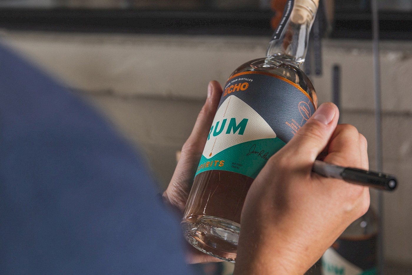
Label design is the most important communication tool a distillery has. Labels communicate practical things, like what’s inside and how it’s made. And they communicate intangible things, like quality and what the brand stands for. Like the brand strategy, we needed to learn a few things before we put ideas on paper.
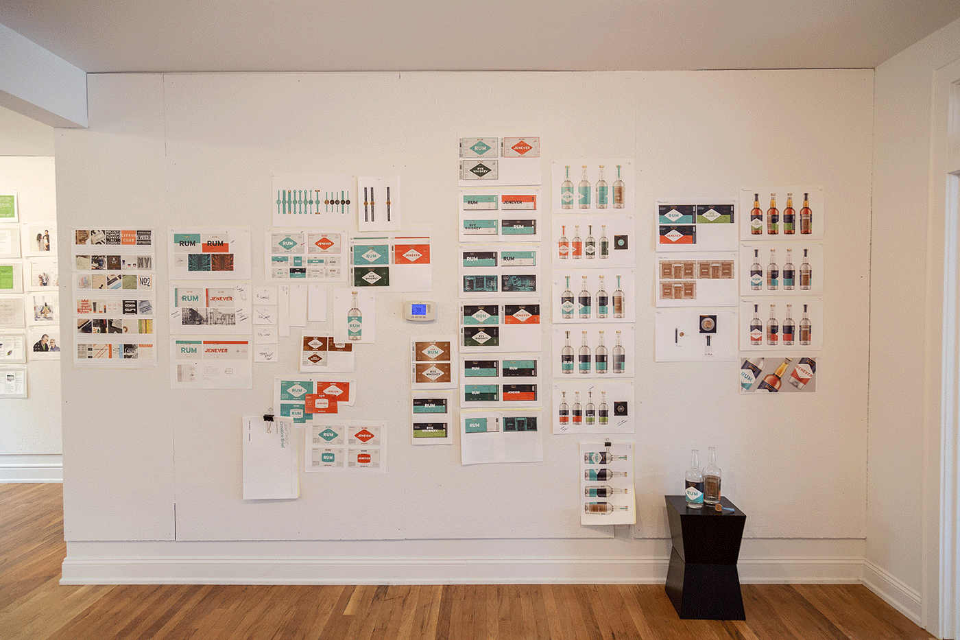
We conducted interviews with both bartenders and craft spirits enthusiasts. We learned that the number one audience we needed to connect with are bartenders. They’re the gatekeepers for new spirits brands. And they wanted clarity in the labels and ergonomics in bottles. These needs come through in physical ways. Our labels don’t wrap all the way around to make it easy to take inventory. And our bottles have a long neck to make grabbing more than one an easy task. If we can get bartenders excited about the spirits and the brand, the word will spread quickly to our other audiences.
The Echo Spirits labels pull all the brand elements into one place. Bold color stands out behind the bar and on the shelf among more complex designs. Small die cuts, metallic finishes, and special imagery printed on the reverse side of the labels (and seen through the back of the bottle) add curiosity and joy to the design. And our logo system functions beautifully. By adding the spirit name in the middle between “Echo” and “Spirits,” the label becomes an extension of the logo.
Since we began working with Echo, they raised seed funding to purchase equipment and build out their distillery and tasting room. They’ve got a thriving community, with excellent bartenders and a top-notch beverage director. They’re poised for a great next chapter, and we can’t wait to see where they go. See the full case study here.