Huntington, a financial institution that’s always looking out for their customers, needed some fresh thinking to reinvigorate their brand. When their new leadership team approached us, they’d decided to shift away from their illustration-centric design system in favor of a more sophisticated one. Together, we created a fresh and engaging brand identity Huntington was eager to embrace and share with the world.
- Finance
- Brand Identity
- Strategy
- Art Direction
- Photography
Visual System
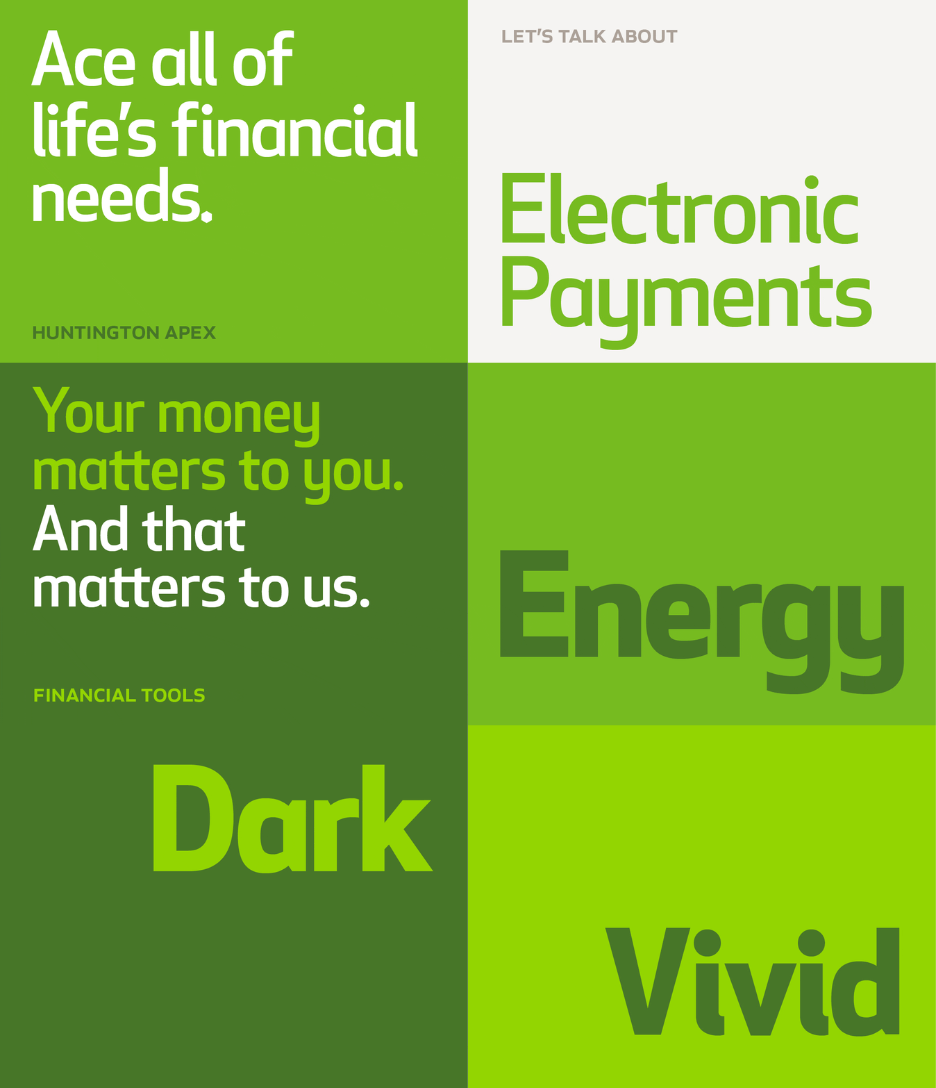
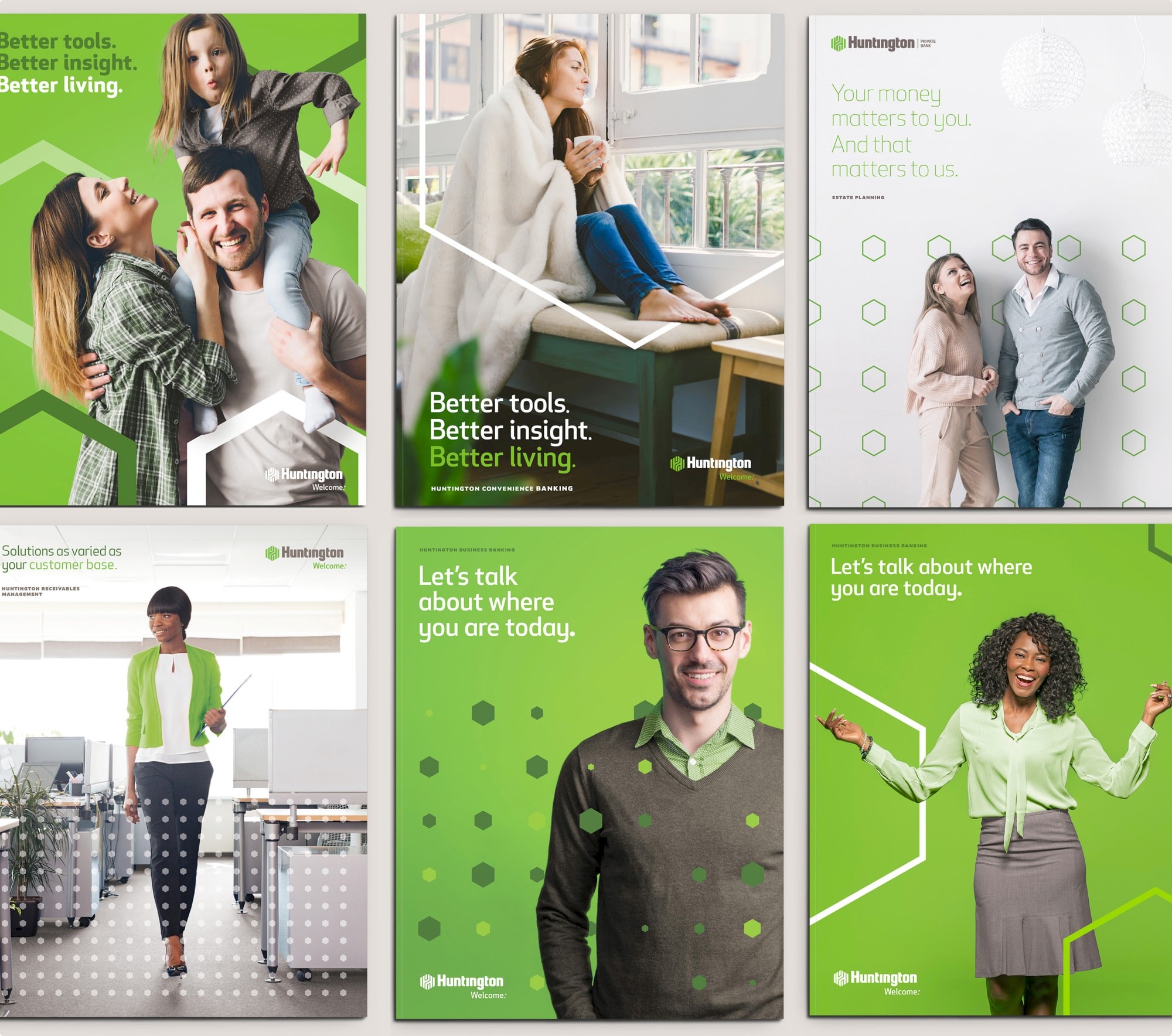
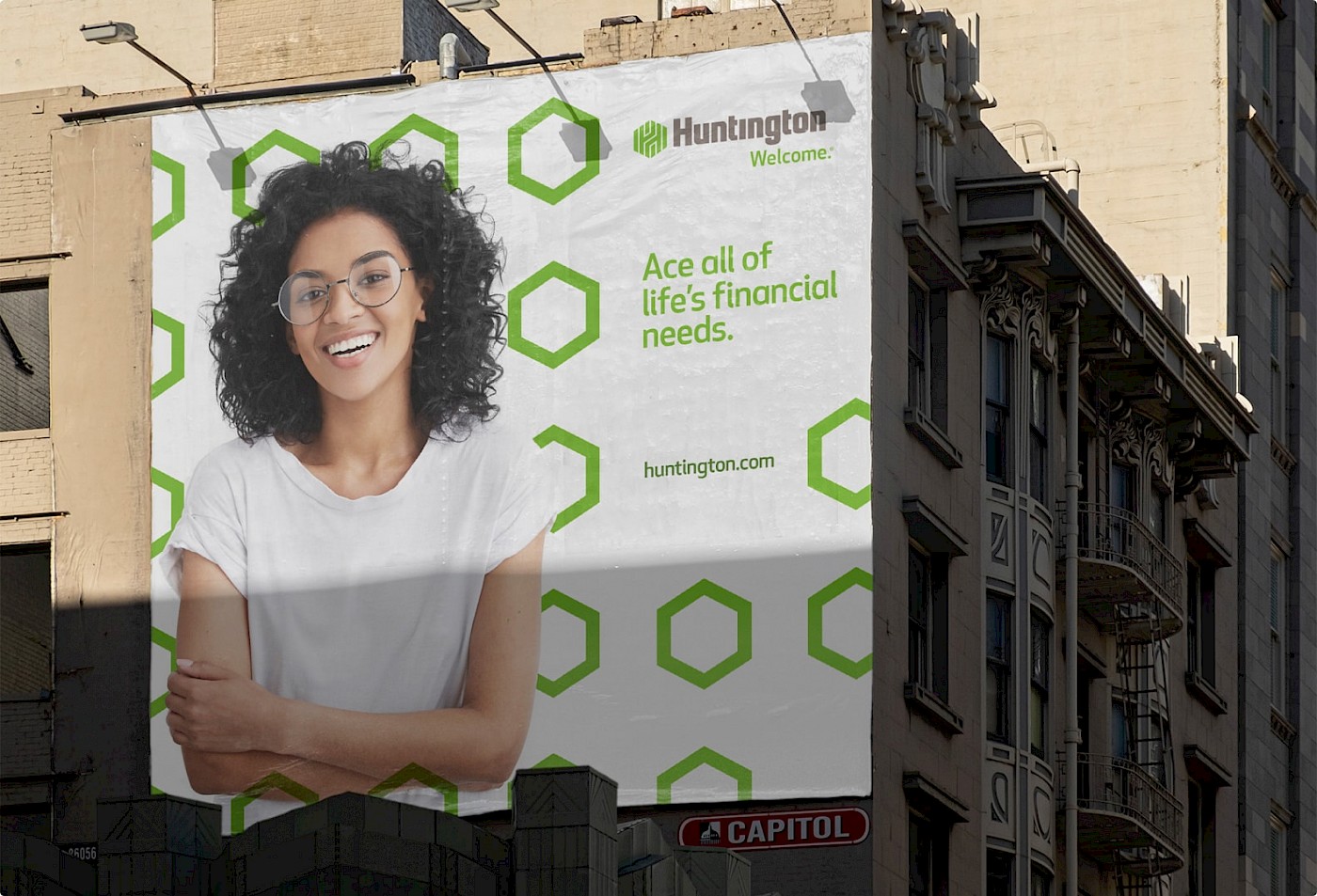
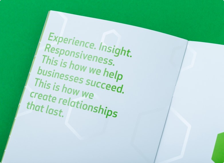
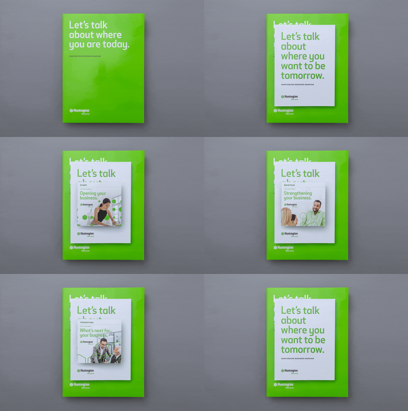
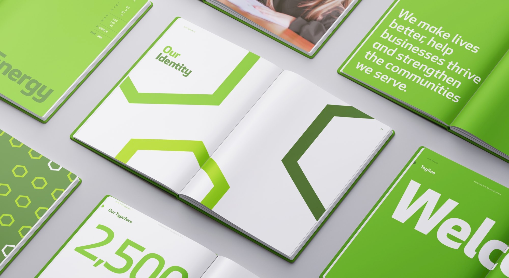
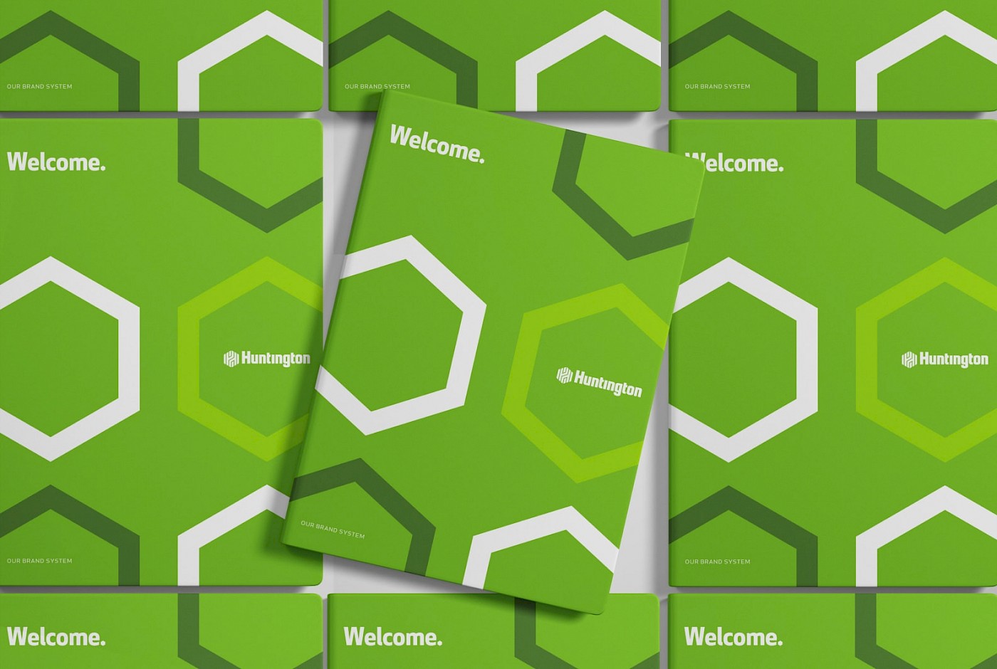
We brought Huntington’s hexagon into the foreground where it belongs. Now, Huntington owns the hexagon. Using only two or three variations of the shape, we scaled them up and down to create visual diversity and play as a metaphor for how Huntington intertwines with customers’ lives.



Brand Book
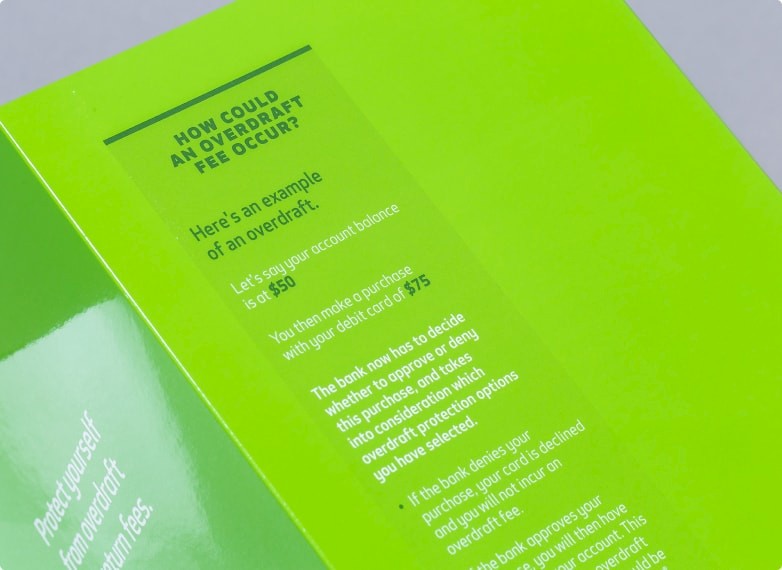
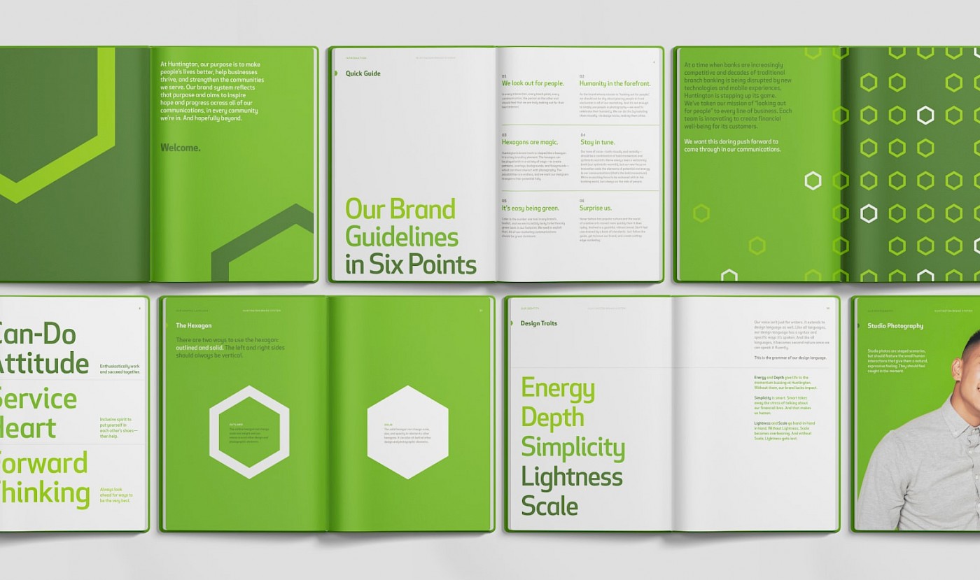
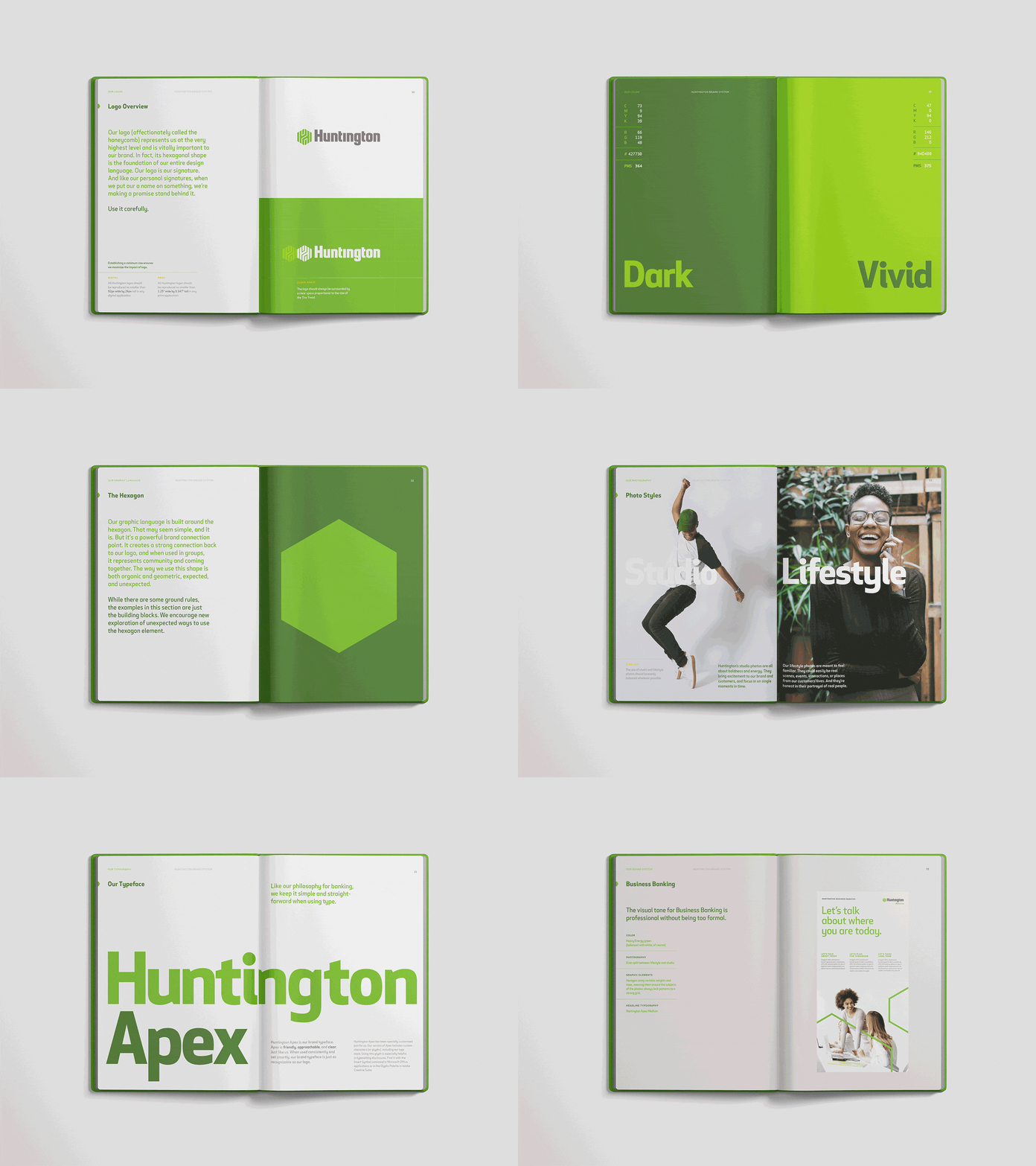
We documented the new brand system in a comprehensive book that provided all the tools to create unity without being uniform. We designed and wrote the guidelines to be representative of the visual system, not a cold set of rules. This encourages creativity rather than squashing it.
Photography
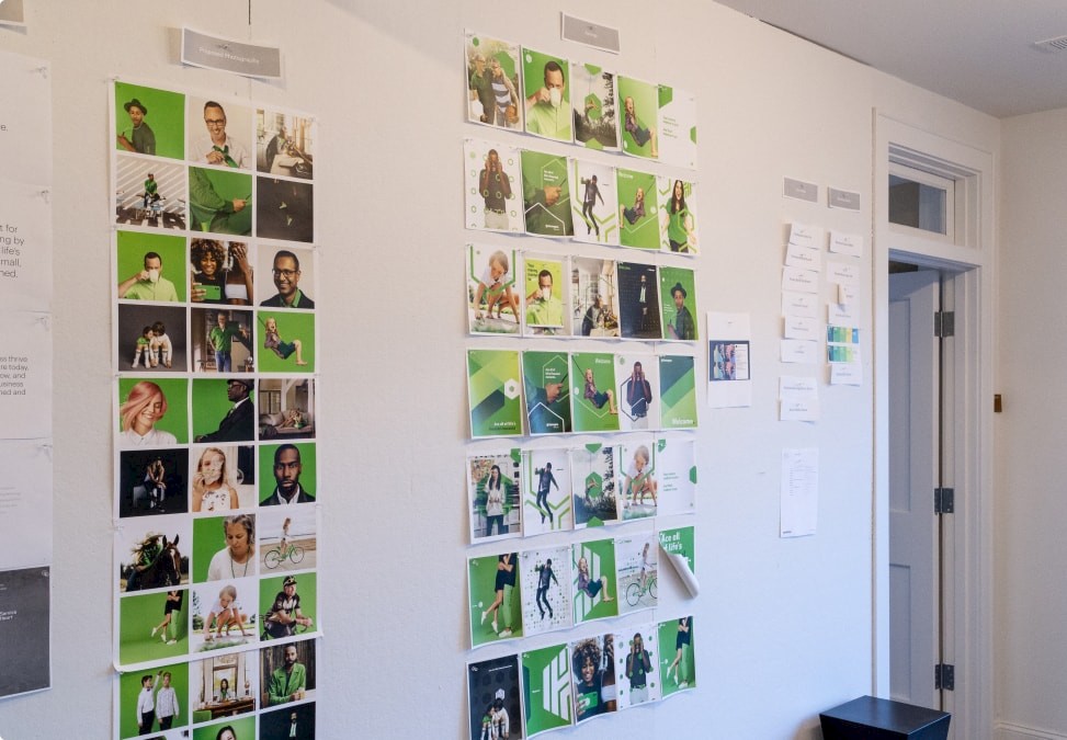
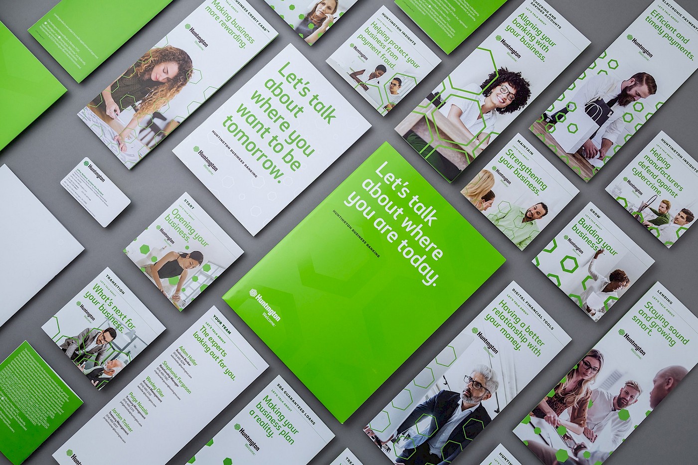
We used photography as a catalyst to re-energize the brand, with some of Huntington’s signature green in every image. A mixture of Midwestern lifestyle and clean studio photography solidified an ownable style that stands out in an overly saturated financial marketplace.




Process
Results
“Working with Nonfiction is like rowing a boat on calm waters — every action moves you forward and the process feels effortless. They’re an incredibly collaborative team, defined by great listening and exponentially productive responses. They went way beyond our expectations, as they always do.”


